BCFC
Soccer Brand & Kit.
A full identity and kit design for a Connecticut-based football club, palette and motifs rooted in industrial heritage, expressed across four distinct kits built around deep navy and burnished gold.
- Client
- BCFC
- Services
- Branding, Print
01
Team Crest
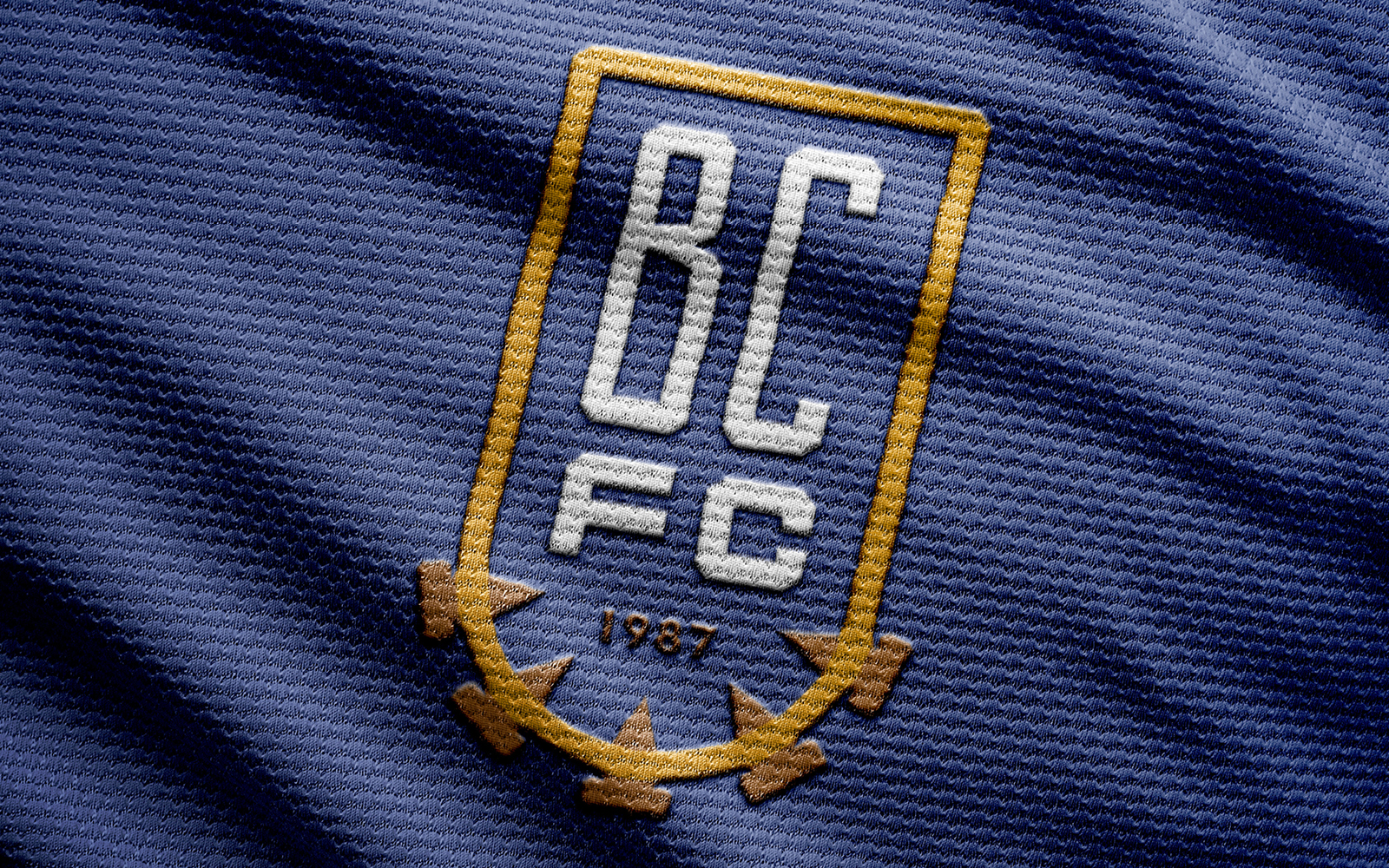
The mark is anchored by industrial motifs: gear-tooth edge, rivet pattern, and the sweeping curve of the Naugatuck River as a structural element. Deep navy grounds it; burnished gold gives it permanence. Built to read at crest scale and hold at badge size.
02
Team Secondary Logos
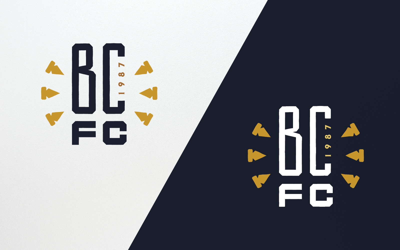
Supporting marks stripped back to their essentials: wordmark, monogram, and badge variants that carry the identity across contexts where the full crest can't breathe. Same industrial DNA, fewer moving parts.
03
Team Home Kit
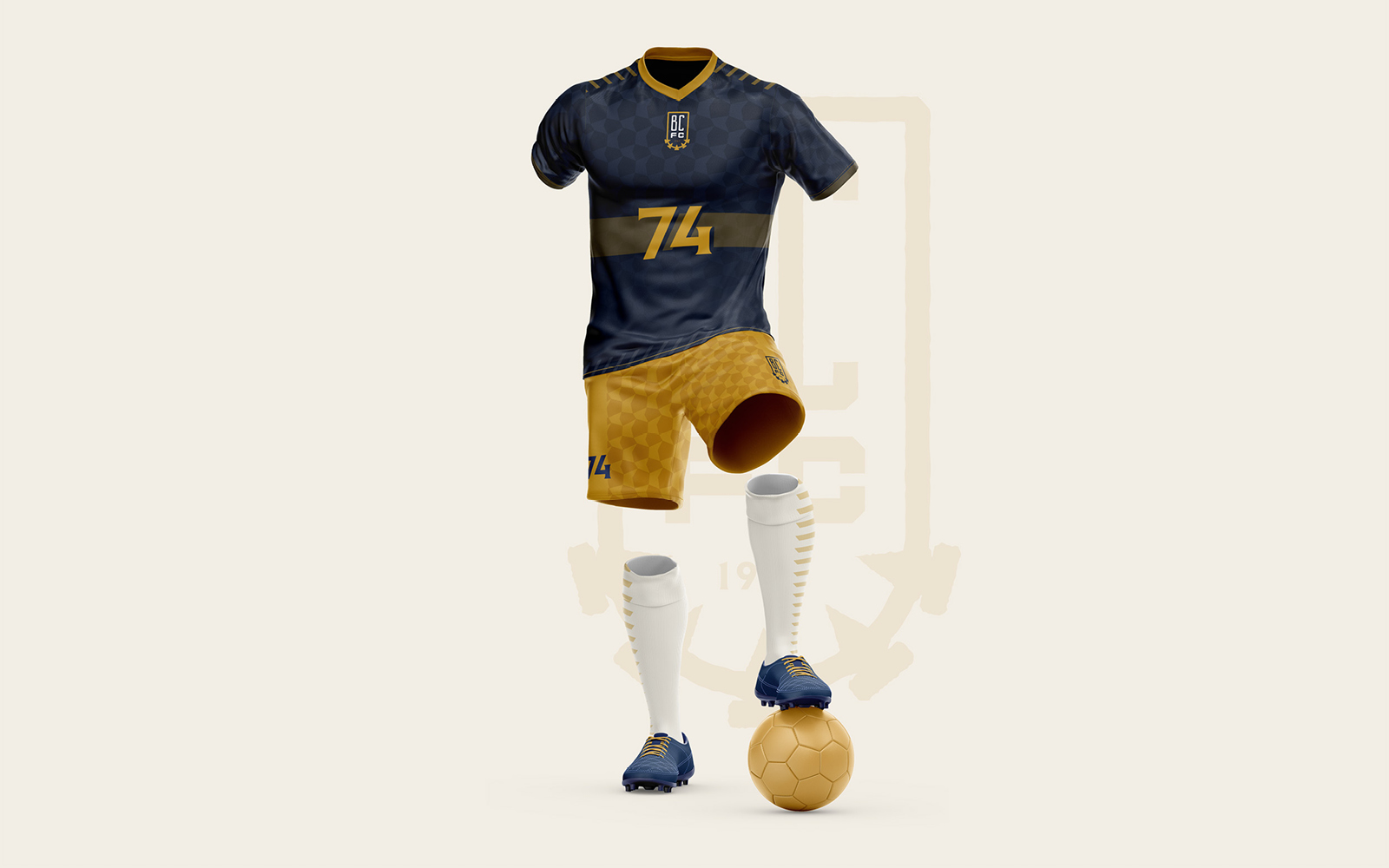
Deep navy base with burnished gold pinstripe, Gold collar and cuffs. Charcoal shorts. White socks with gold band. Rivet pattern sublimated across the shirt body as a background texture.
04
Team Apparel
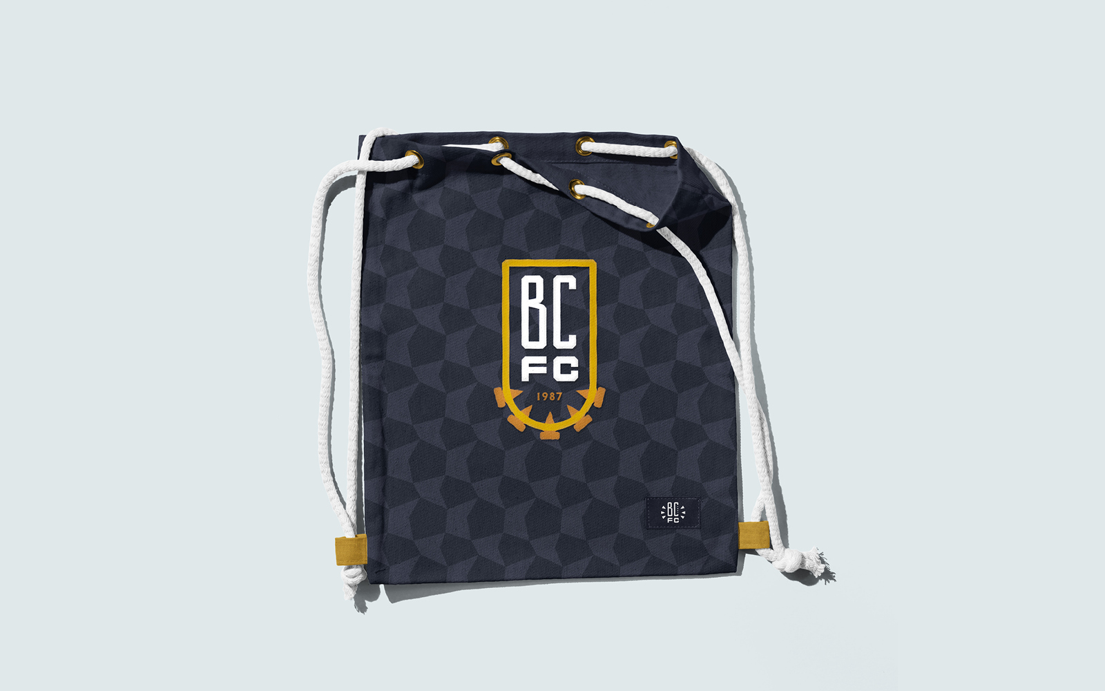
The apparel is designed for the fans and to be a reflection of the kit design.