01
Logos
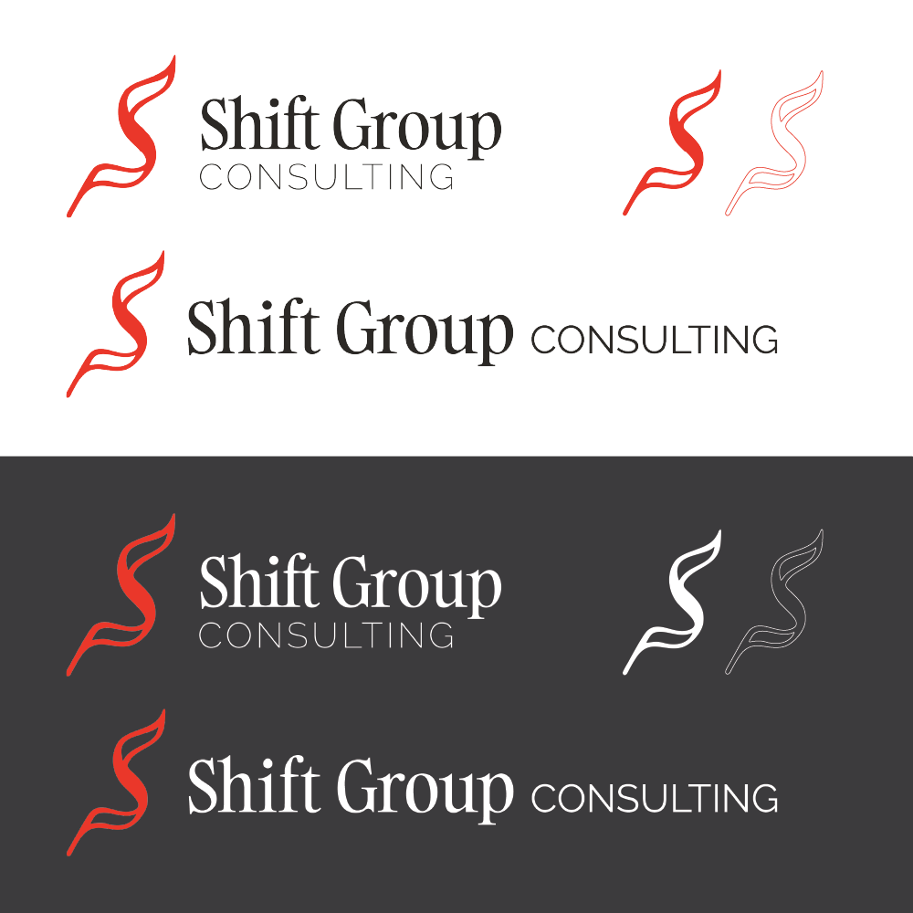
The final mark is simple by intention, a clean symbol that carries the firm's name without competing with it. It works at a business card scale and a conference backdrop, and reads as established without being stiff.
Shift Group Consulting
Brand and identity for a consulting firm that needed to read as experienced and senior without losing the grounded feel of a boutique practice. Restrained, high-class, and built to hold its own in the room.
01
The final mark is simple by intention, a clean symbol that carries the firm's name without competing with it. It works at a business card scale and a conference backdrop, and reads as established without being stiff.
02
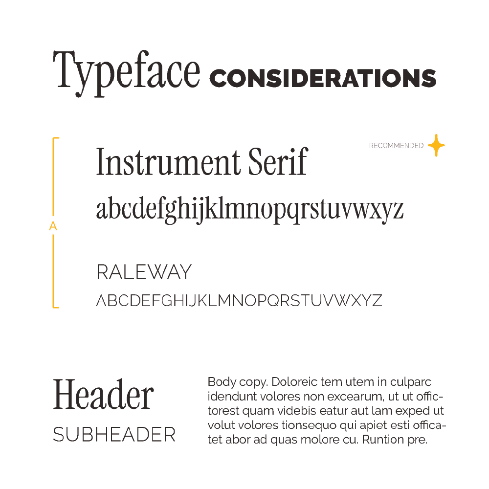
Typography does much of the tonal heavy lifting in a consulting brand. The selected pairing leads with a serif that signals experience and permanence, supported by a cleaner weight for supporting copy that keeps layouts from feeling dated.
03
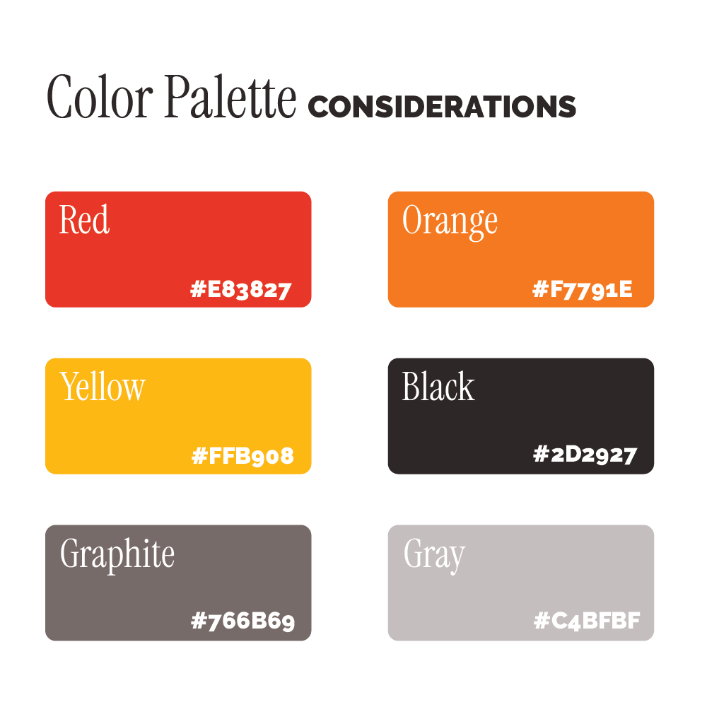
The palette is deliberately restrained: deep, grounded tones that communicate stability and seniority, with a single warm accent used sparingly to keep the brand from feeling cold or corporate.
04
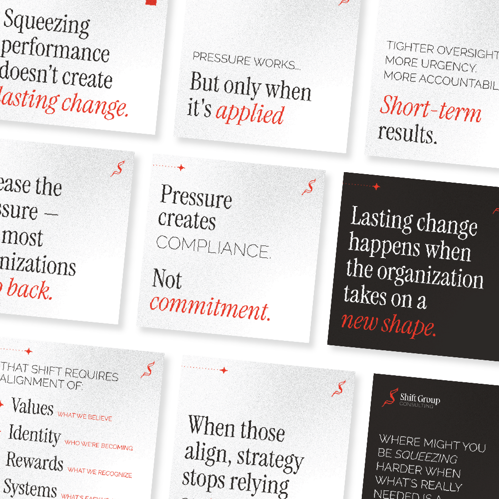
The carousel format translates the brand into a LinkedIn and social context, sequenced slides that introduce the firm, its approach, and its value without relying on a long-form read. Built for scroll, designed for credibility.
05
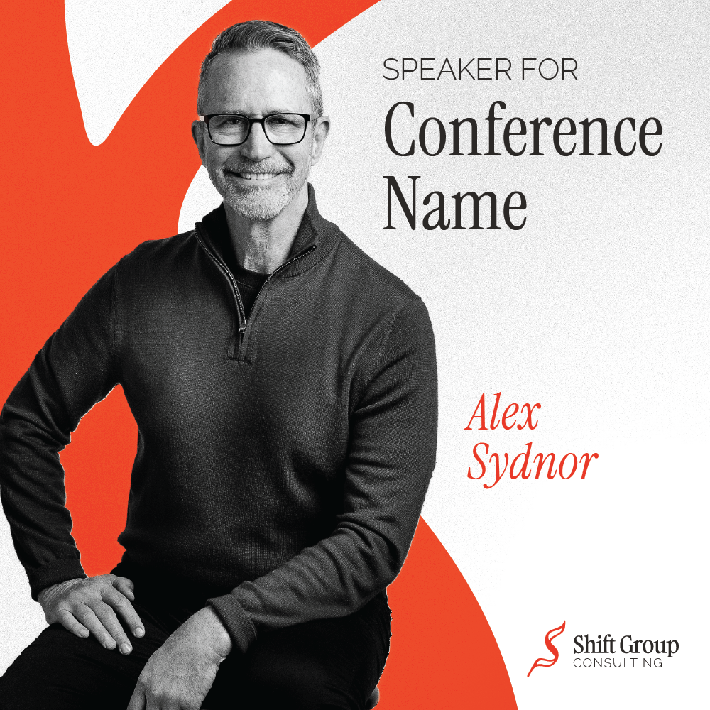
Event assets put the brand in a high-visibility context: speaking engagements, industry gatherings, and partner announcements. The format is designed to feel worthy of the room Shift Group is entering.
06
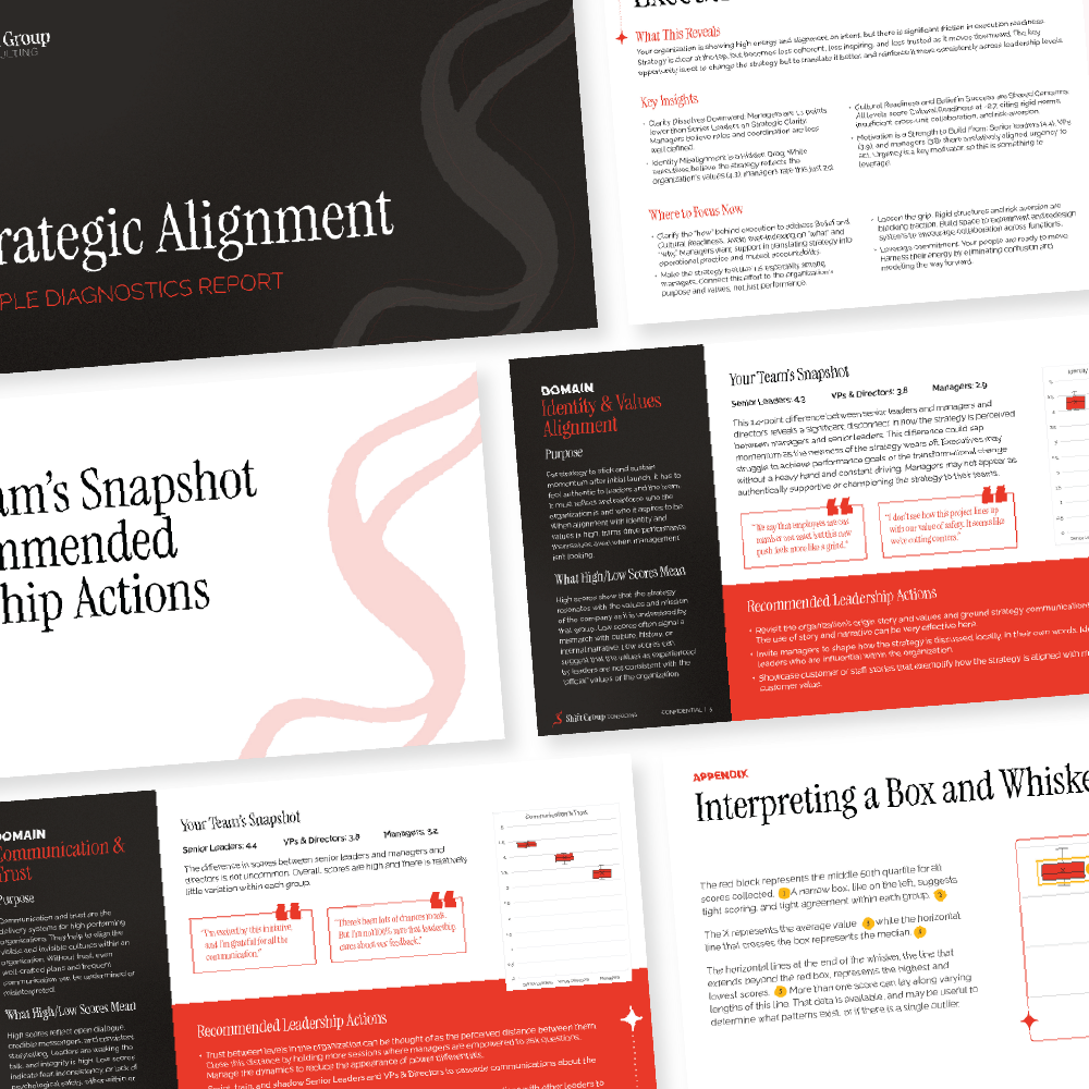
A sample deliverable shows how the brand extends into the firm's actual work product. The report template brings the identity into a dense, professional document while keeping it readable, the kind of thing a client keeps on their desk.