
01
Logo Exploration
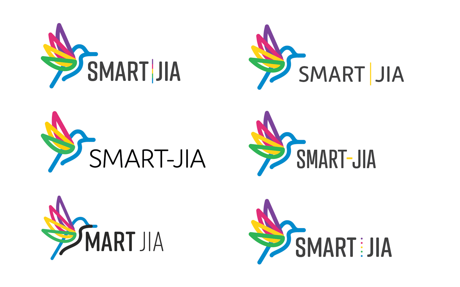
Initial concepts explored playful, motion-forward marks that could read as pediatric without feeling juvenile, a spectrum of colorful line-based forms sampled from nature, movement, and energy.
Smart-JIA
An international pediatric clinical trial for juvenile idiopathic arthritis needed an identity that could reassure children and families while keeping clinical credibility, and travel across languages, formats, and care settings worldwide.

01
Initial concepts explored playful, motion-forward marks that could read as pediatric without feeling juvenile, a spectrum of colorful line-based forms sampled from nature, movement, and energy.
02
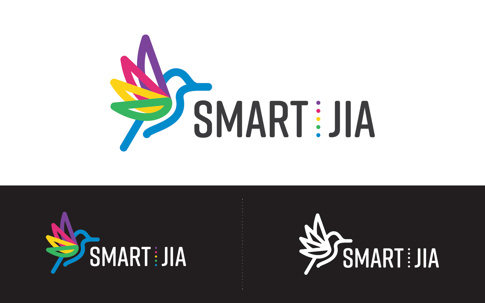
The strongest explorations were refined into a tighter set, balancing legibility at small sizes with the vibrant, continuous-line language that defines the final mark.
03
The selected mark distills the exploration into a single form, a continuous, motion-suggesting line that feels both scientific and approachable. It works at the scale of a badge, a banner, and everything in between.
04
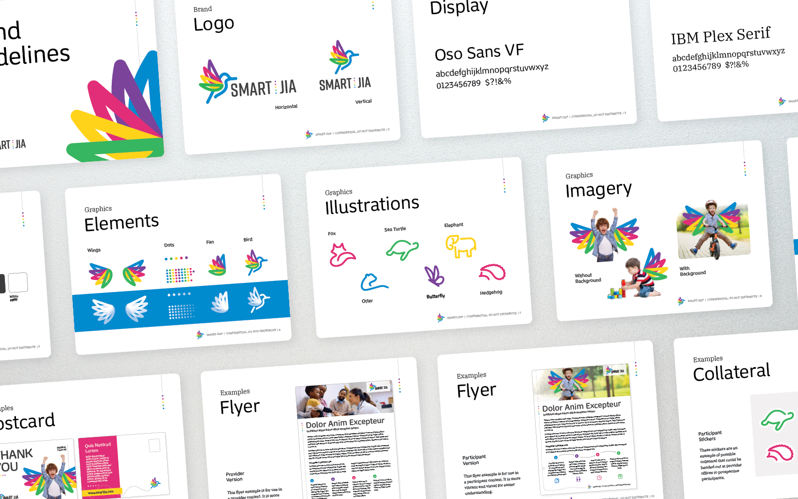
A full identity system (typography, color, and graphic language) was built out from the refined mark to support international patient and provider materials across a wide range of languages and formats.
05
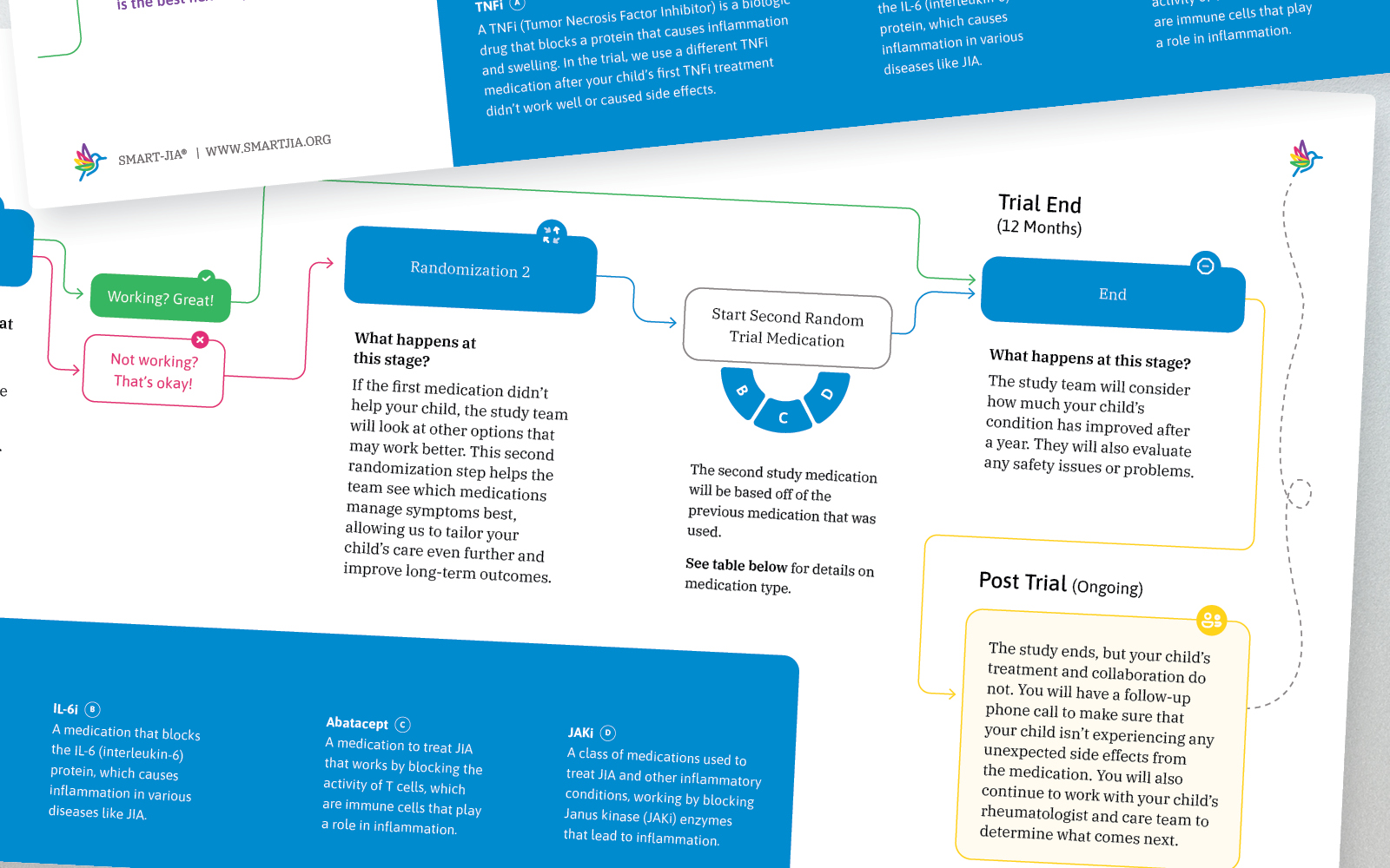
Clinical trials live and die by their timelines. This branded timeline graphic translates complex study phases into a clear, patient-friendly visual, keeping participants informed and engaged throughout the duration of the trial.
06
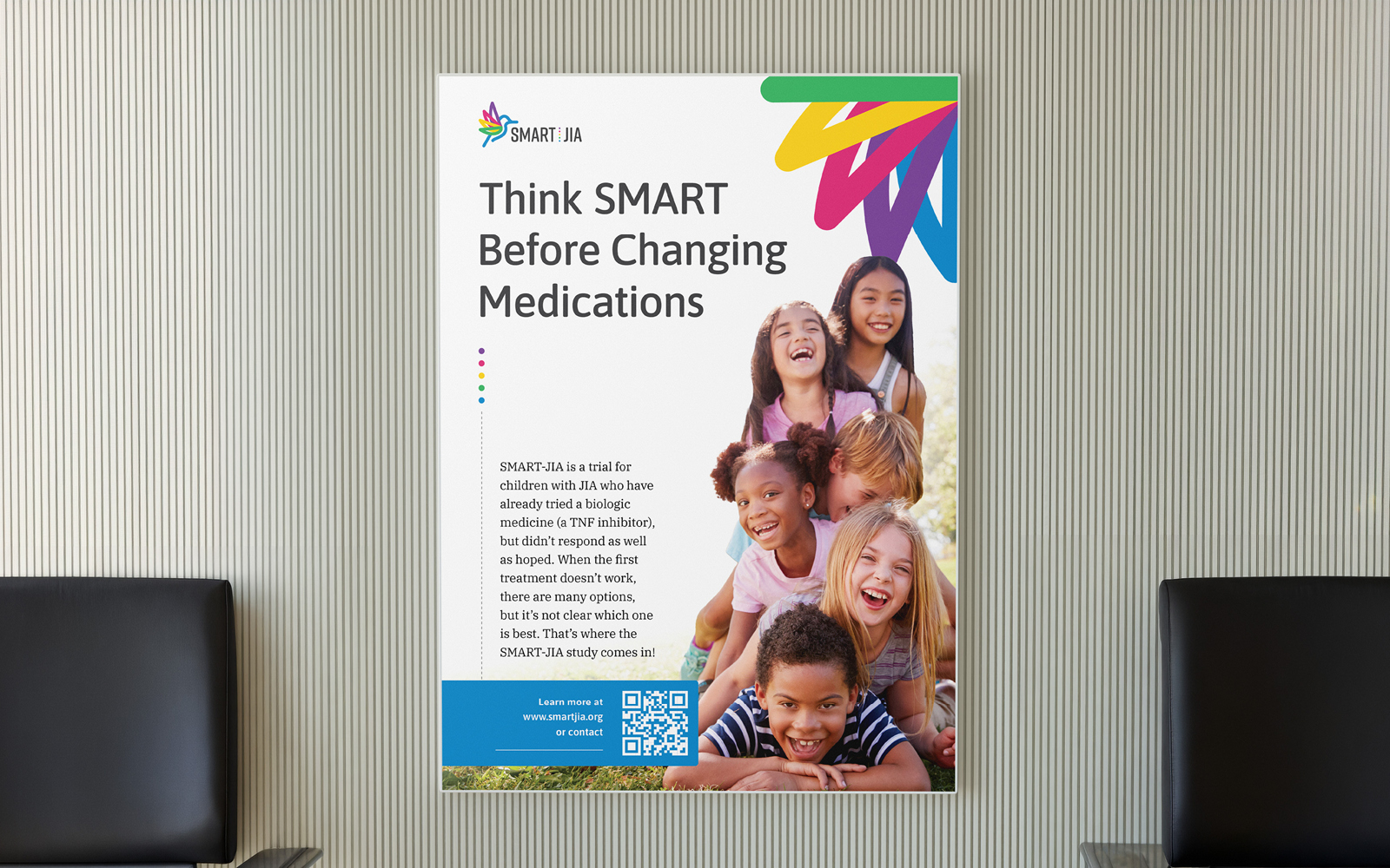
Recruitment posters needed to work across hospital corridors, pediatric waiting rooms, and digital displays simultaneously. The poster system applies the brand at scale while keeping the tone warm enough to speak directly to families.
07
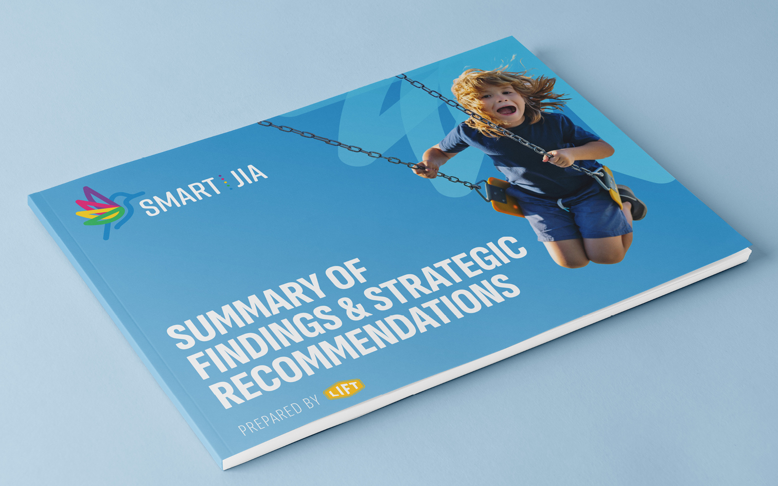
Research output required its own branded treatment, a document system that carries the visual identity into dense, data-heavy content without sacrificing readability. The result bridges clinical rigour and the brand's human-first voice.
08
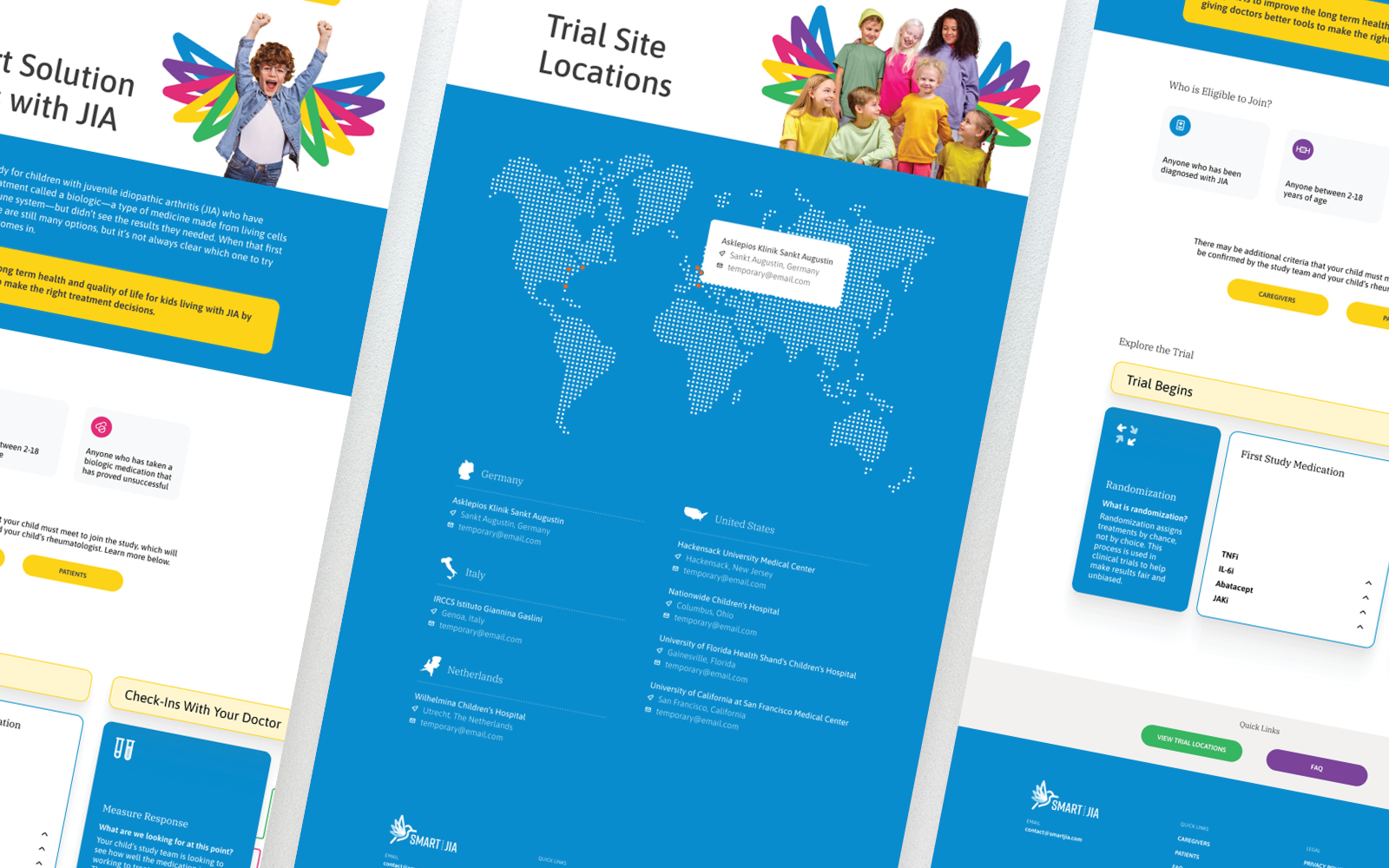
The public-facing trial website had to serve two very different audiences simultaneously: caregivers seeking reassurance and clinicians evaluating eligibility. The design creates clear entry points for each, with a tone and visual language that carries the full brand into a responsive, internationally-accessible digital experience.