$ cat work/bcfc.md
BCFC
A brand redesign and refinement for a community-owned football club.
- client
- Brass City FC
- year
- 2026
- scope
- Crest, secondary marks, kit, apparel
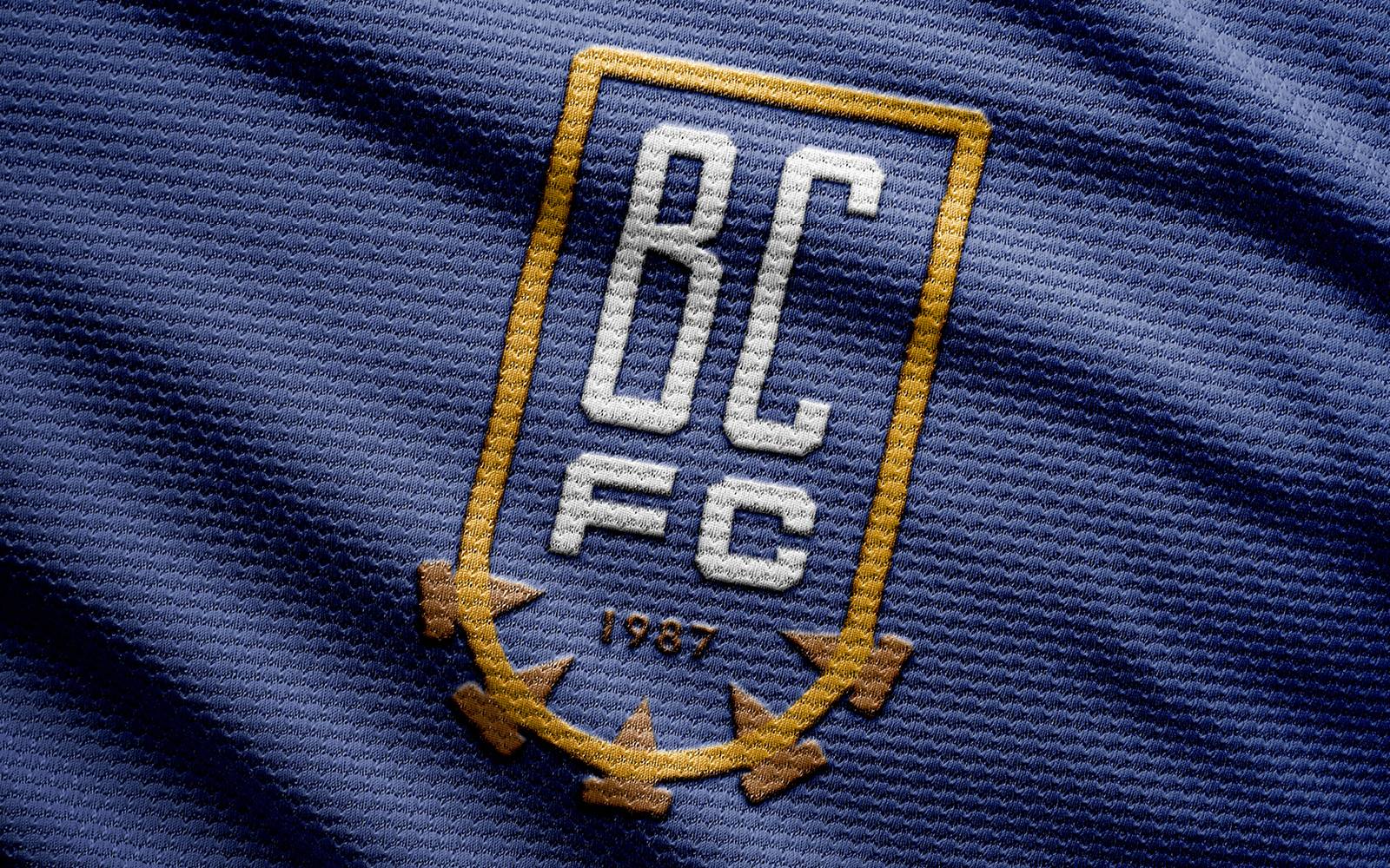
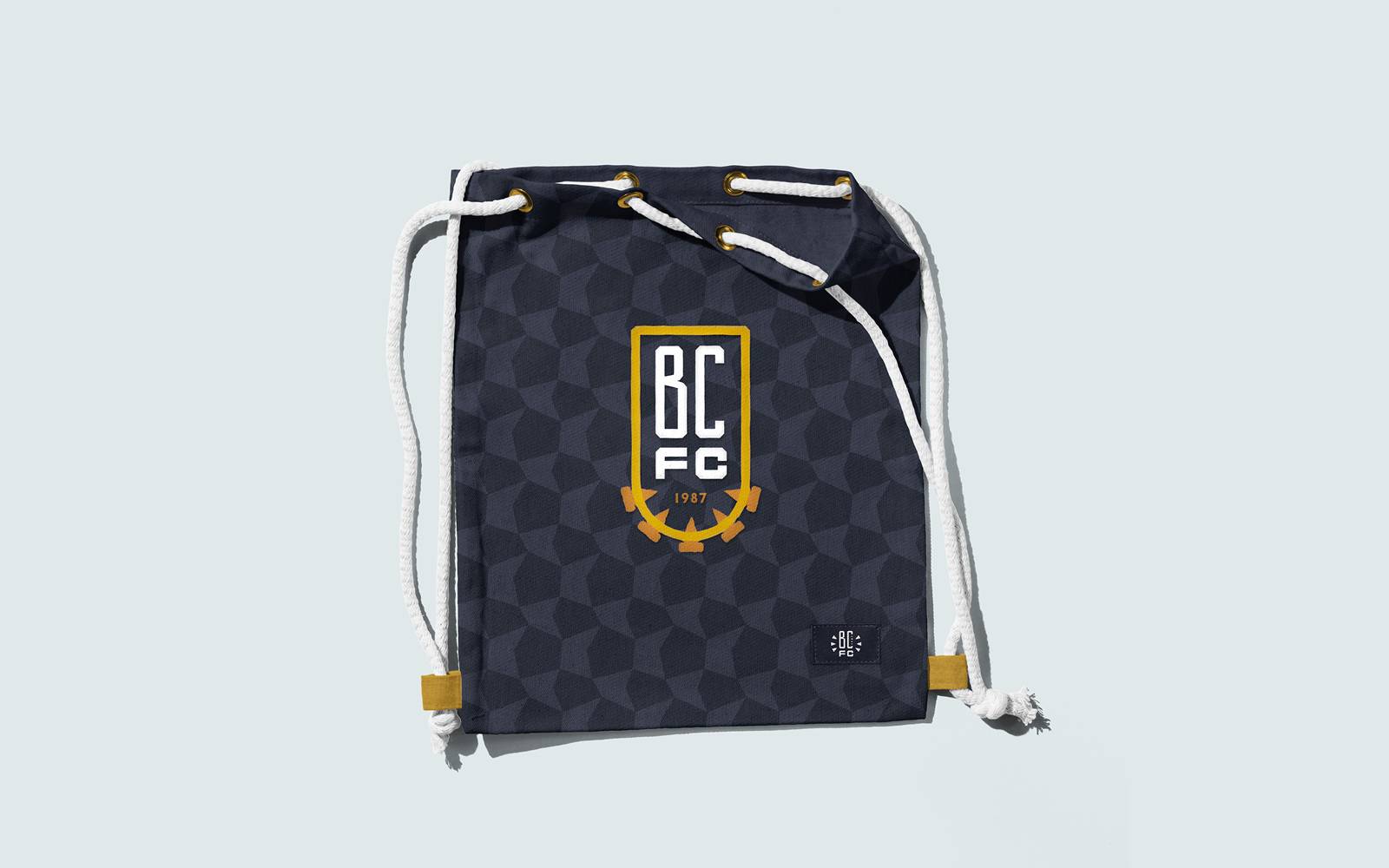
- The club crest was the starting point for this project as it is the spearhead of almost all supporter interactions.
- The two biggest requests was to implement a feeling of toughness, hand-built, and legacy, while also invoking symbols of the watch industry of Brass City. The 'spikes' that adorn the bottom of the shield are an homage to the balance wheel in automatic watches.
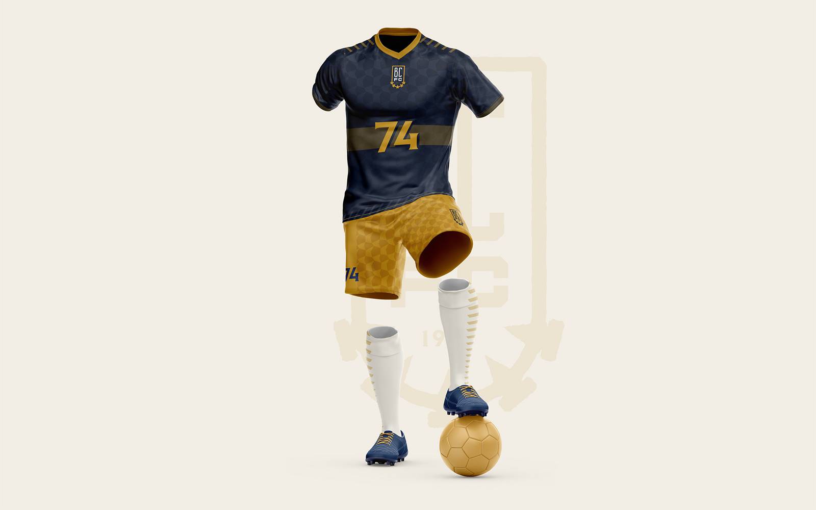
- The kit redesign focused on texture and boldness, two of the main requests. There are three main elements that make up the new home kit design.
- The first is the horizontal stripe across the torso which represents a watch band and highlights the front lettering, and will display the main title sponsor when it is signed.
- The second are the stripes on the shoulders and socks which reprent the ticks of time at linear intervals.
- The final element is the texture which is an homage to the patterns often found inside of automatic watch cases.
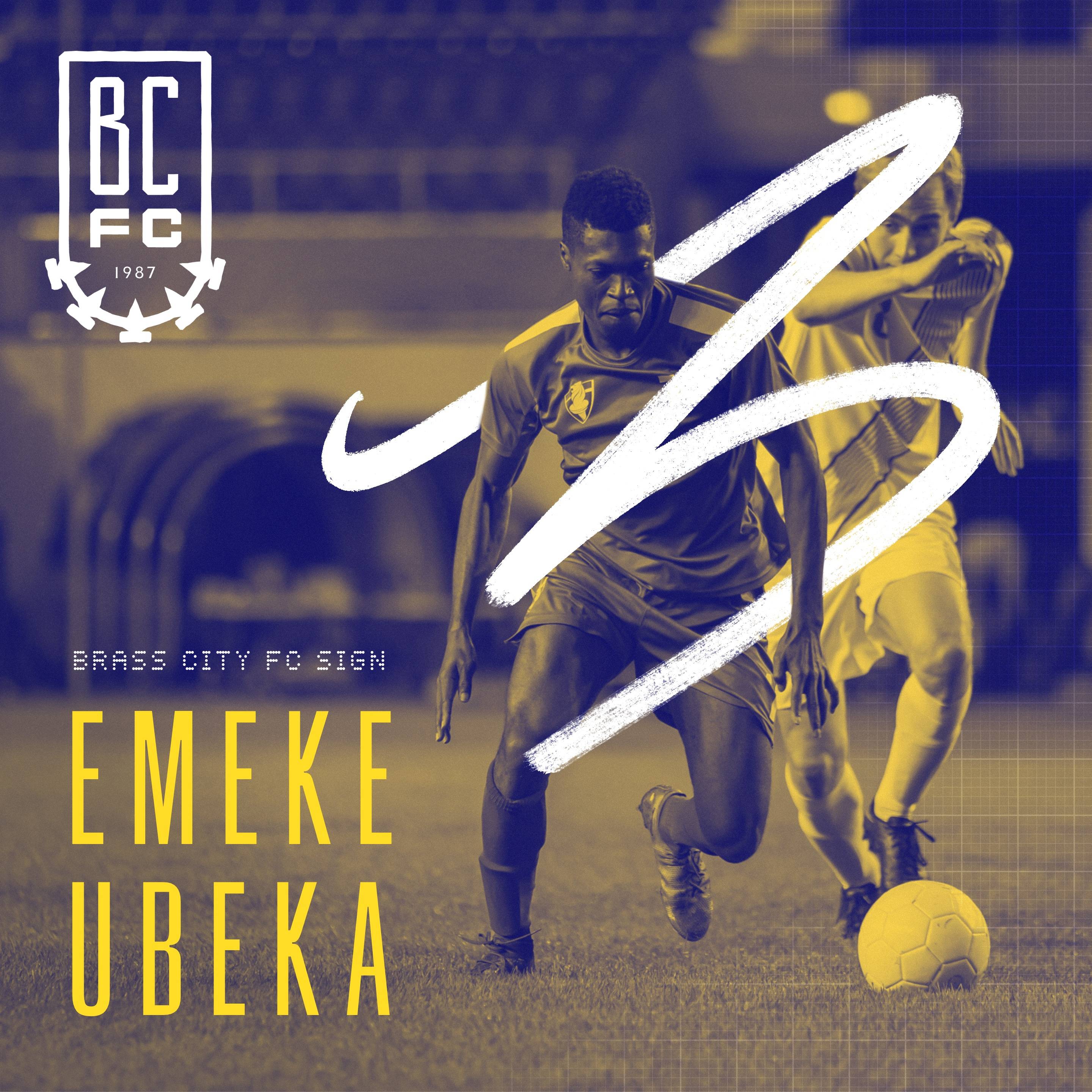
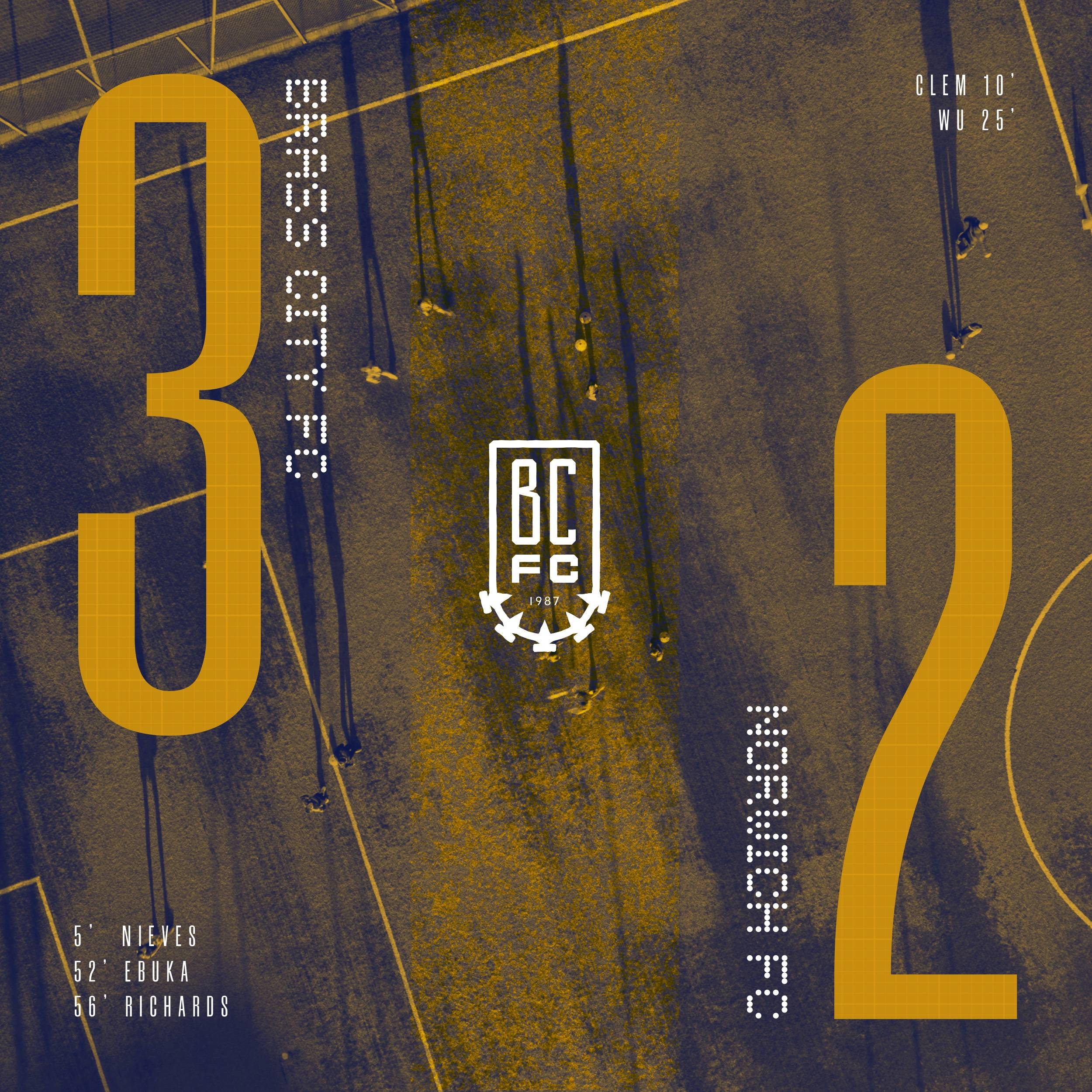
- Social assets were an important part of the branding excercise as it a main method of communication to fans in the modern era of professional soccer. Following the groundwork that has been laid out by the crest and kit redesign the social assets lean toward the handmade feel and the BCFC's unique palette. The dotted secondary typeface here pays homage to the brass stamping that was such a large part of the cities history.
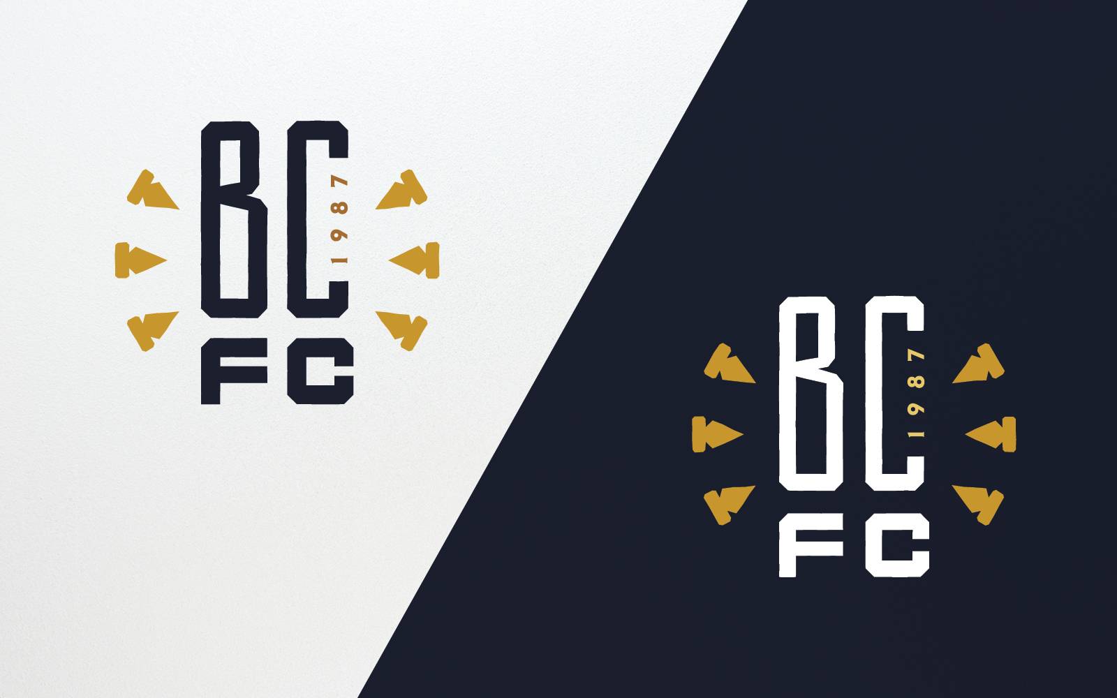
- The need for a secondary mark was also needed when the crest was not able to be used. The main criteria for this mark was the need for a more compact layout.