$ cat work/smart-jia.md
SMART-JIA
Branding, print, and data visualisation for a paediatric juvenile idiopathic arthritis trial running across eleven sites.
- client
- Smart-JIA
- year
- 2024
- scope
- Brand identity, print, web development
- sites
- 7 across 4 countries

- Smart-JIA is a multi-site international clinical trial testing a treatment options for juvenile idiopathic arthritis. The study enrolls children between two and eighteen, who have been diagnosed with JIA, and anyone who has taken a biologic medication that has proved unsuccessful.
- With the wide gamut of patients, as well as their caregivers, and the providers that would handle enrollment, the brand needed to be approachable to all. Furthermore, with the study being international, it needed to be accepted and usable in different cultures as well.
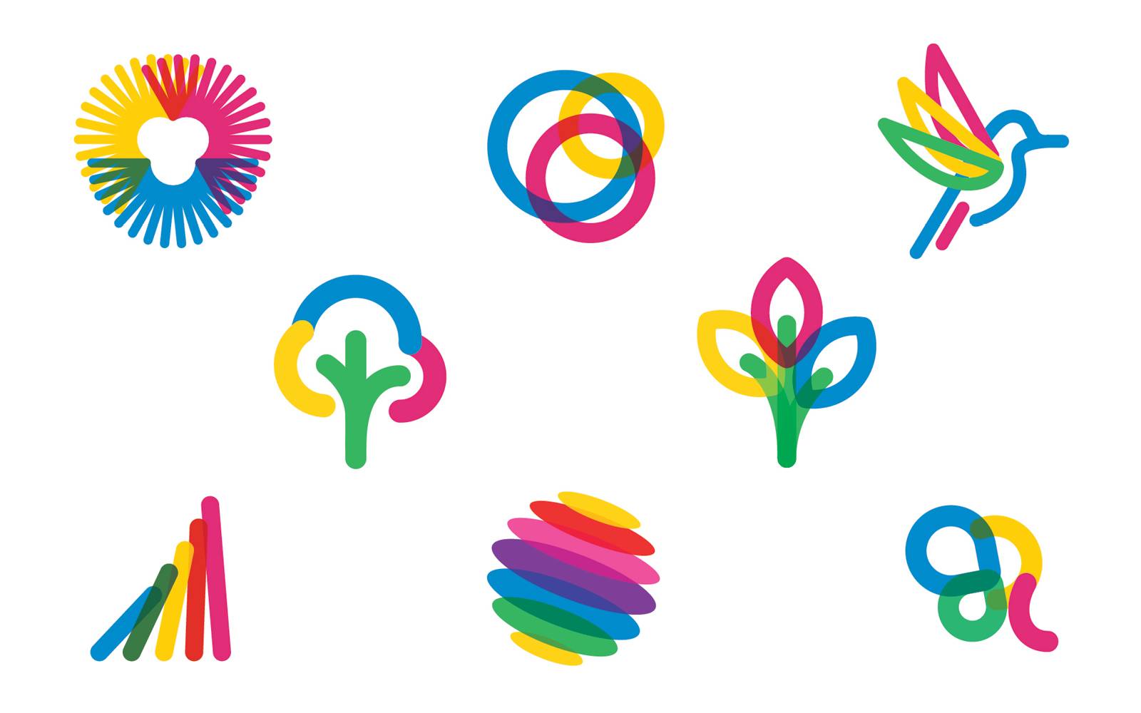
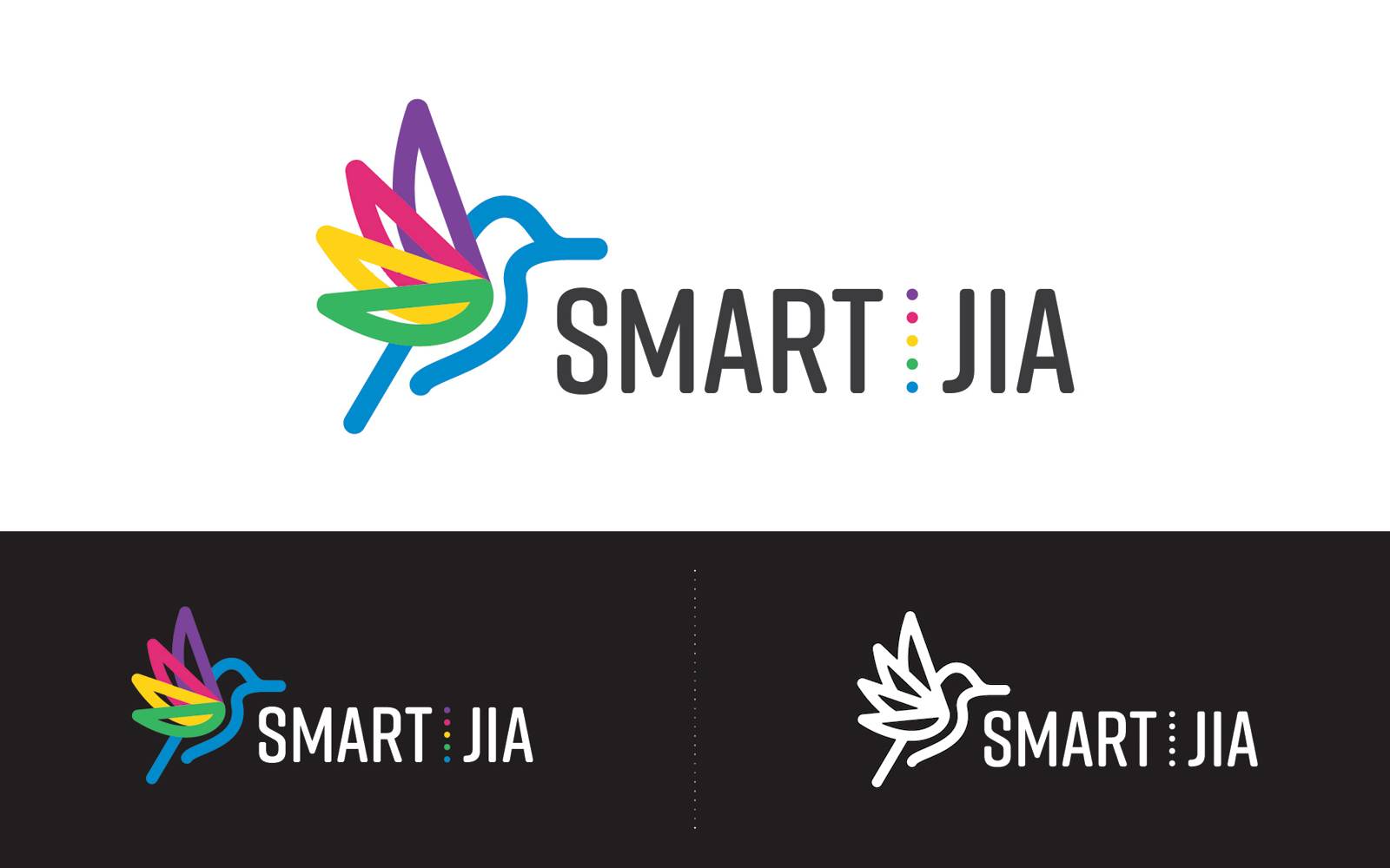
- The logo utilizes the flight of the hummingbird as a bird that is associated with speed, beauty, and kindness. The upward trajectory evokes the feeling of healing and growth for the children who will take part in the study. The mark has four wings to represent the four major steps in the study for each patient.
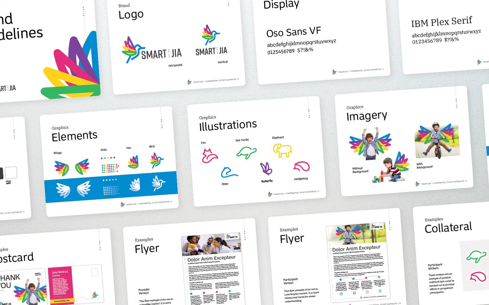
- The brand guide provided to the committee was extensive and included everything from usage, to imagery, to voice. It also included examples for collateral and multi-lingual pieces. This guide was then sent to the trial locations for their reference when creating localized assets.
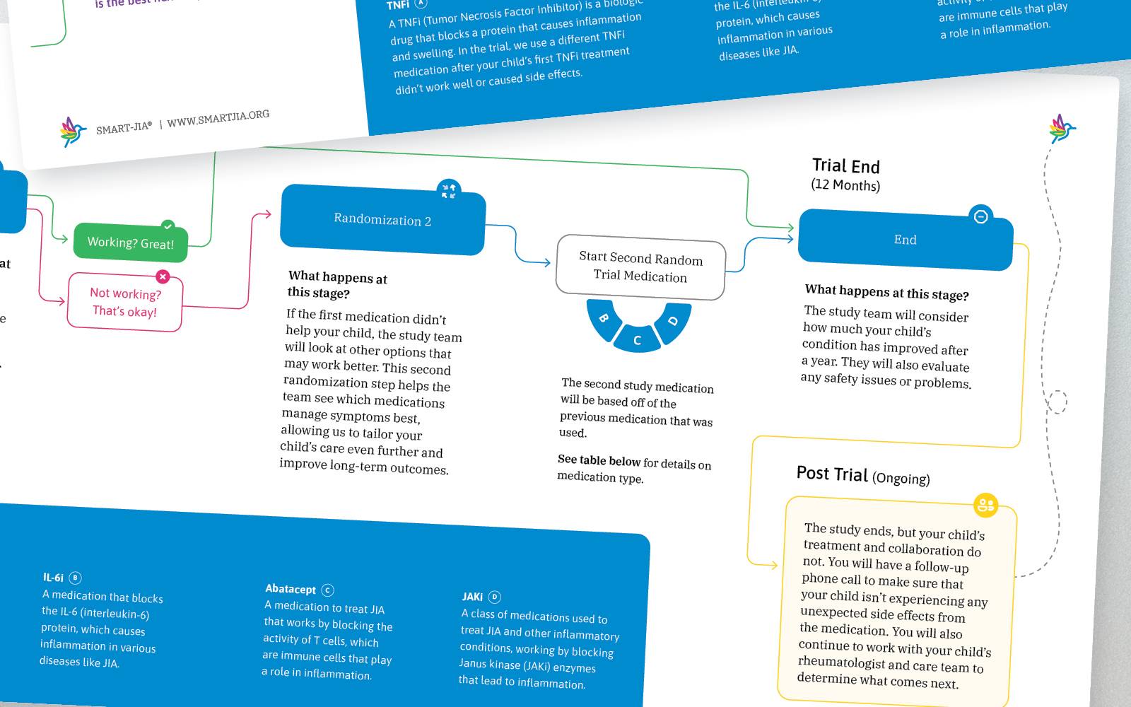
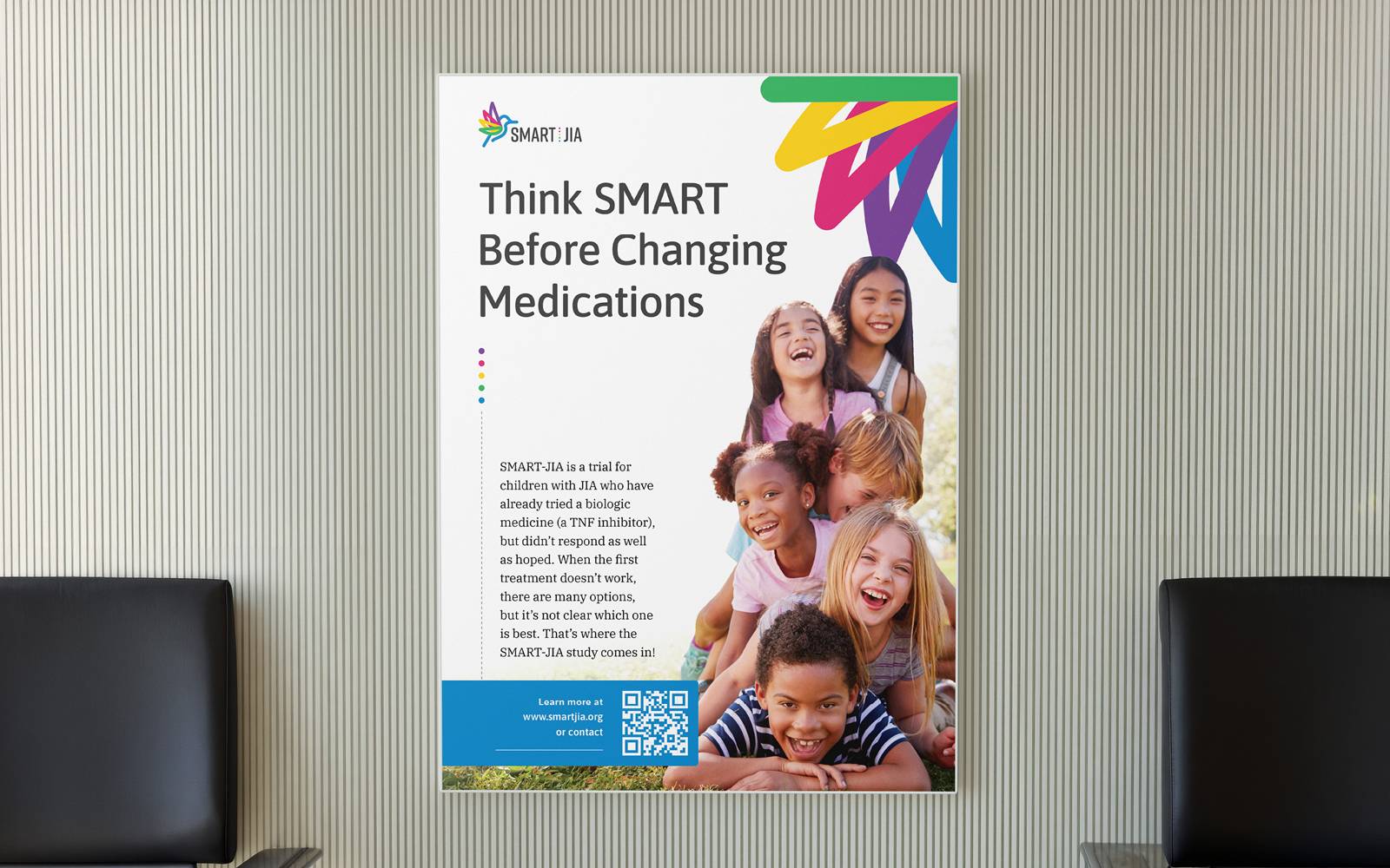

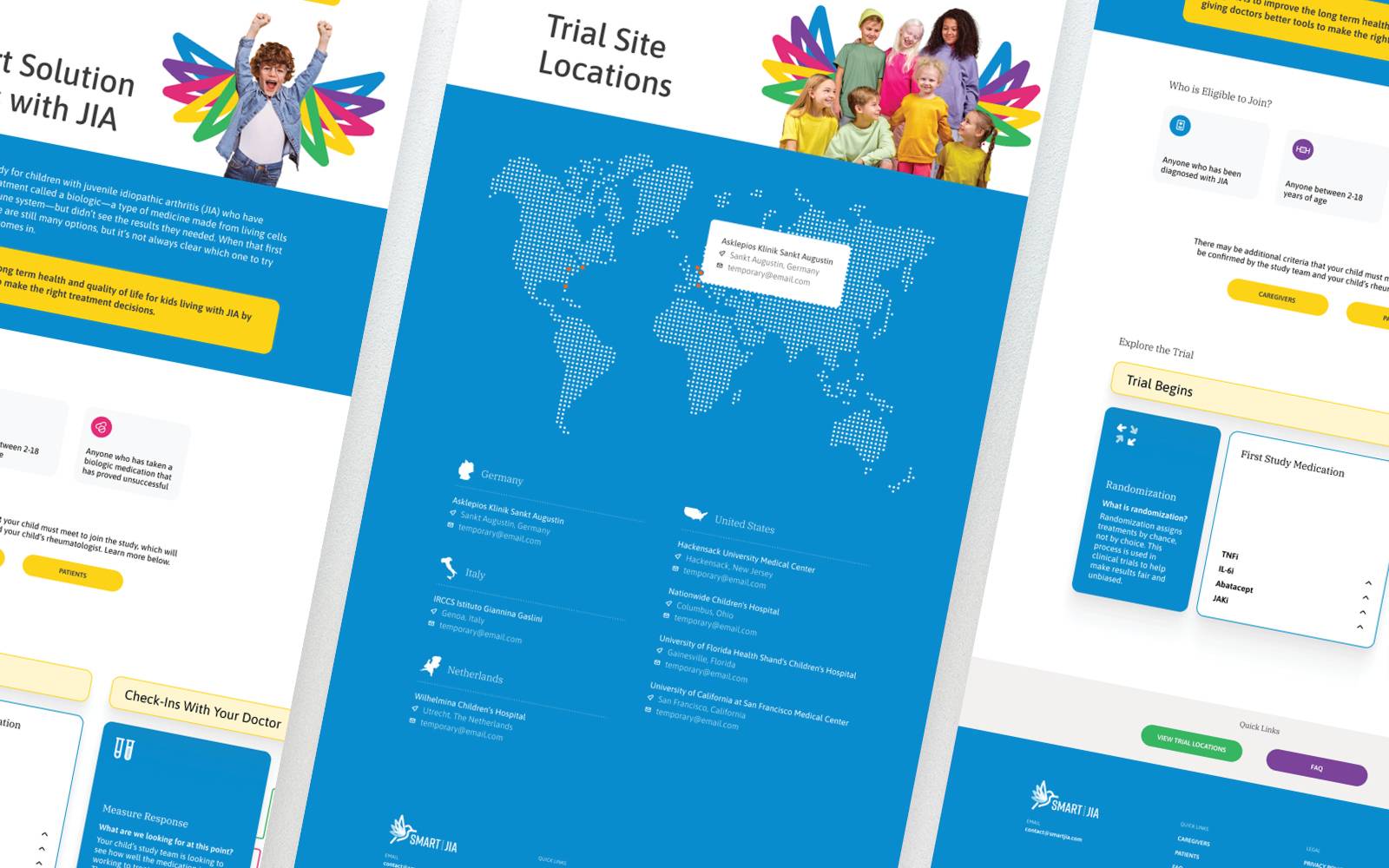
- Collateral was broken into three target audiences during the ideation stage; patients, caregivers, and providers. Each cohort had a different voice and intent that weighed on the content and design. Some pieces also were created with patient and caregivers in mind, such as waiting room posters, where both would be audiences would be present.
- The website was also created to follow the brand standards as well as provide information to the aforementioned audiences. It also allowed users to find the nearest trial location, have frequently asked questions answered, and sign up for future information releases.